John is my academic big brother, meaning that we have the same PhD advisor and he graduated several years ago. He made a post to Facebook yesterday giving an observation he made about some data. What do you think? Give just one criticism, approval, or suggestion on a specific aspect of his observation. Be as specific as possible, but limit yourself to just one thing (to give everybody a chance) and try to find something different than what other students have already mentioned. Feel free to bring in outside data or do some of your own analysis of the data.
John's post
Saw this:
Curiously, the US-happiness map looks very similar to the US election map. There appears to be a very strong relationship between happy states being those that voted for Obama, and sad states being those that voted for Romney. As this was done in 2011, it wouldn't be because Obama just won the election, though I suppose it could be because Obama was the current president.
Still, even if Obama wasn't the president, I think you'd pretty much find the same relationship. I think there are definite differences in how people think, and which electoral candidate that they will favor.
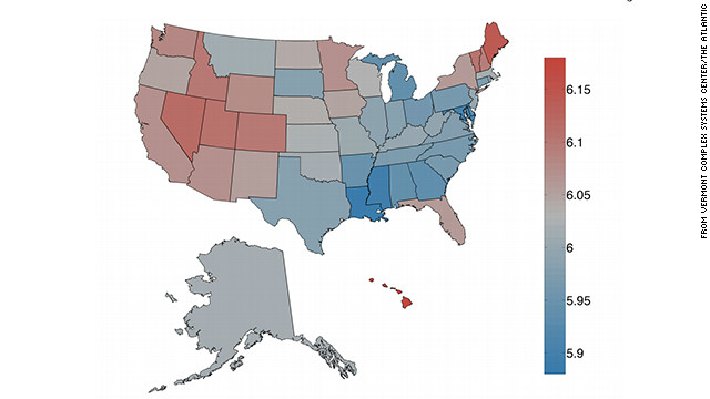 |
| blue = sad, red = happy |
A 2012 electoral map, for comparison:
 |
| blue = Obama, red = Romney |

To quote from the article: "rainbow is one of the happiest words and earthquake is one of the saddest."
ReplyDeleteI immediately thought, 'how would someone measure happiness?' And especially according to Twitter.
1. the Sample Size is questionable because not everyone owns a twitter account. I don't!
2. If rainbow is the happiest word, well then we need to look at how many states have a lot of rainbows. I know New York didn't because its always muggy and overcast, and places with a lot of humidity tend not to see rainbows often. In New Mexico we see rainbows all the time. And if someone tweets 'rainbow', they might be saying something like "You know, life isn't all rainbows and unicorns".
Earthquake is another one. I don't even really understand how that's a sad word. A tweet could be "I hope those people in are okay from the Earthquake. That doesn't even have to do with how happy they are with their current life.
I think this data is very interesting, and provides an example of a correlation that most people would not think to look at. One suggestion I would give is to be wary of using this information as a means of drawing conclusions about a cause and effect relationship between happiness and choice of political candidate. As cliche as it sounds, it is important to remember that correlation does not equal causation. Thus it is impossible to definitively state that choice of political candidate causes happiness, or that happiness causes preference of one political party over another.
ReplyDeleteAs a scientist I am incredibly skeptical of any correlation between this data. Although we know from our discussions in class that the 6.6 million people who own Twitter accounts is a significant number of people from which we could find a small amount of error; I believe that Colleen is correct in her assertion that we cannot draw a conclusion from the looks of the maps or a chi square analysis of the numbers. What we have is a mushy example of what people rated as happiness compared to an actual example of how people voted. This is my scientific viewpoint.
ReplyDeleteMy OPINION?
I completely agree! With the correlation and the chi square that Kevin so politely carried out! Very interesting...